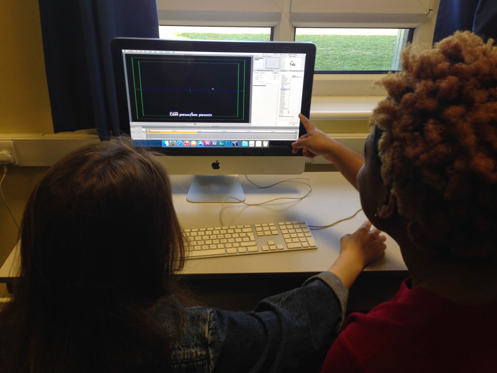
During Edit Week 2, I chose the font for our titles which connote the genre well in my opinion. I made a list of several options for fonts that were appropriate, which we narrowed down once we had discussed as a group which font was the most suitable for our target audience.
I also graded some shots including the corridor tracking shot (by lowering the brightness, and increasing the contrast and saturation) to make the shots more compelling and eye-catching. As a group we completed grading the first scenes and checking that the colour tints were similar throughout. I also organised the shots into folders to make it quicker and easier to locate the best footage. Amber and I created the logo for our production company (EGA) using Photoshop.
EGA Production Company logo
Gift and I choosing fonts for our titles
Creating the titles (including changing the style/effects/timing of titles)
I enjoyed learning to grade individual shots and cutting down footage to produce a finished sequence. The post-production stage has significantly improved my editing skills, however I would have liked to have done more in editing the voiceovers and sound effects. I am much more confident in getting on with the project as I have learnt many more technical skills in Premiere Pro (such as using the three-way colour corrector and producing the split-screen effect). Although, some areas to improve would be checking shots to make sure of continuity issues and cutting down the shots to better timings.
Before/after examples of grading:
We had to make sure we changed the colour of each shot equally so that they matched throughout the sequence.


No comments:
Post a Comment